Who knew such a small setting could make such a big improvement
Author
Matthew J. Kmiecik
Published
May 20, 2025
In a previous post, I wrote about how using ChatGPT for R suggestions has taught me some really cool tips and tricks.
Here’s another post about one of these cool tips that I recently learned; one that I probably should have known long before the advent of ChatGPT! That is, using the labeller = ... argument in ggplot2’s facet functions: facet_wrap() and facet_grid().
Let’s get started with an example use case and see how this simple argument will help others (and yourself) with interpreting facetted figures.
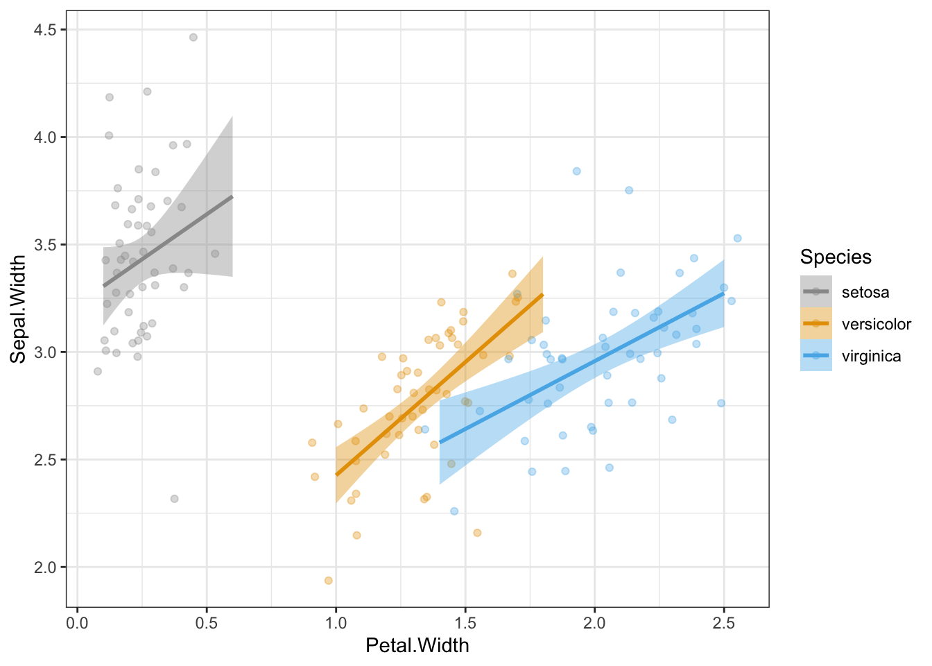
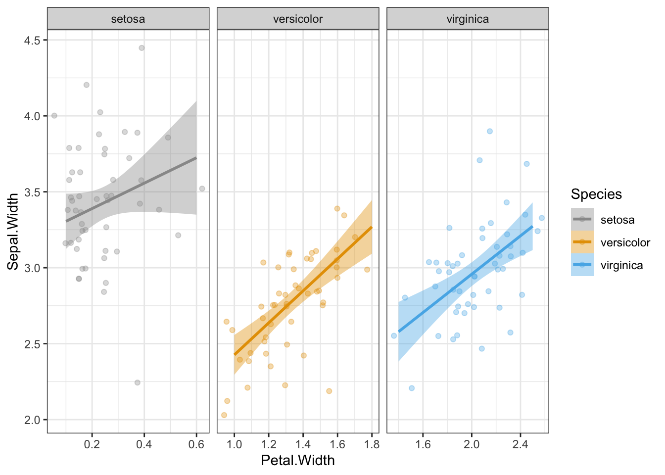
Let’s say we wanted to break out each species into a separate panel. We can do this using facet_wrap().
p +facet_wrap(~Species, scales ="free_x")
facet_wrap() nicely labels the facets with the values of the variable. Now this is a great default setting, but when sharing this figure with an audience unfamiliar with the data, they could be left wondering what setosa, versicolor, and virginica are, especially if the redundant legend is removed. Also, data are sometimes not clearly labelled when it comes to categorical variables (e.g., 0, 1).
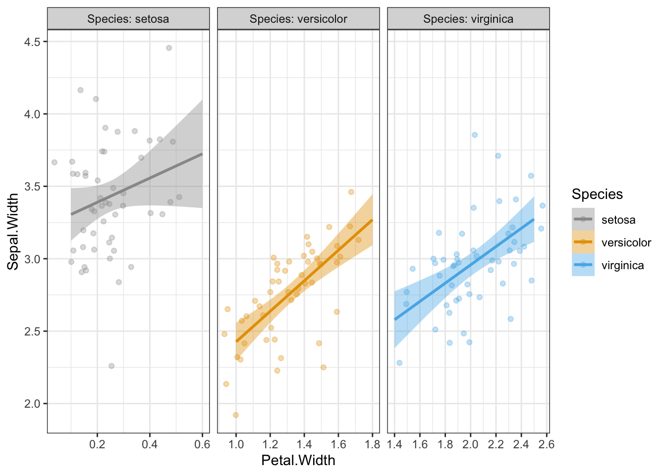
To make the labeling explicit in the facets, we can using the labeller argument and set this to label_both:
p +facet_wrap(~Species, scales ="free_x", labeller = label_both)
Now “Species:” appears before each facet label, clearly indicating that these values indicate different species.
Let’s go through a different use case where the values are less clear.
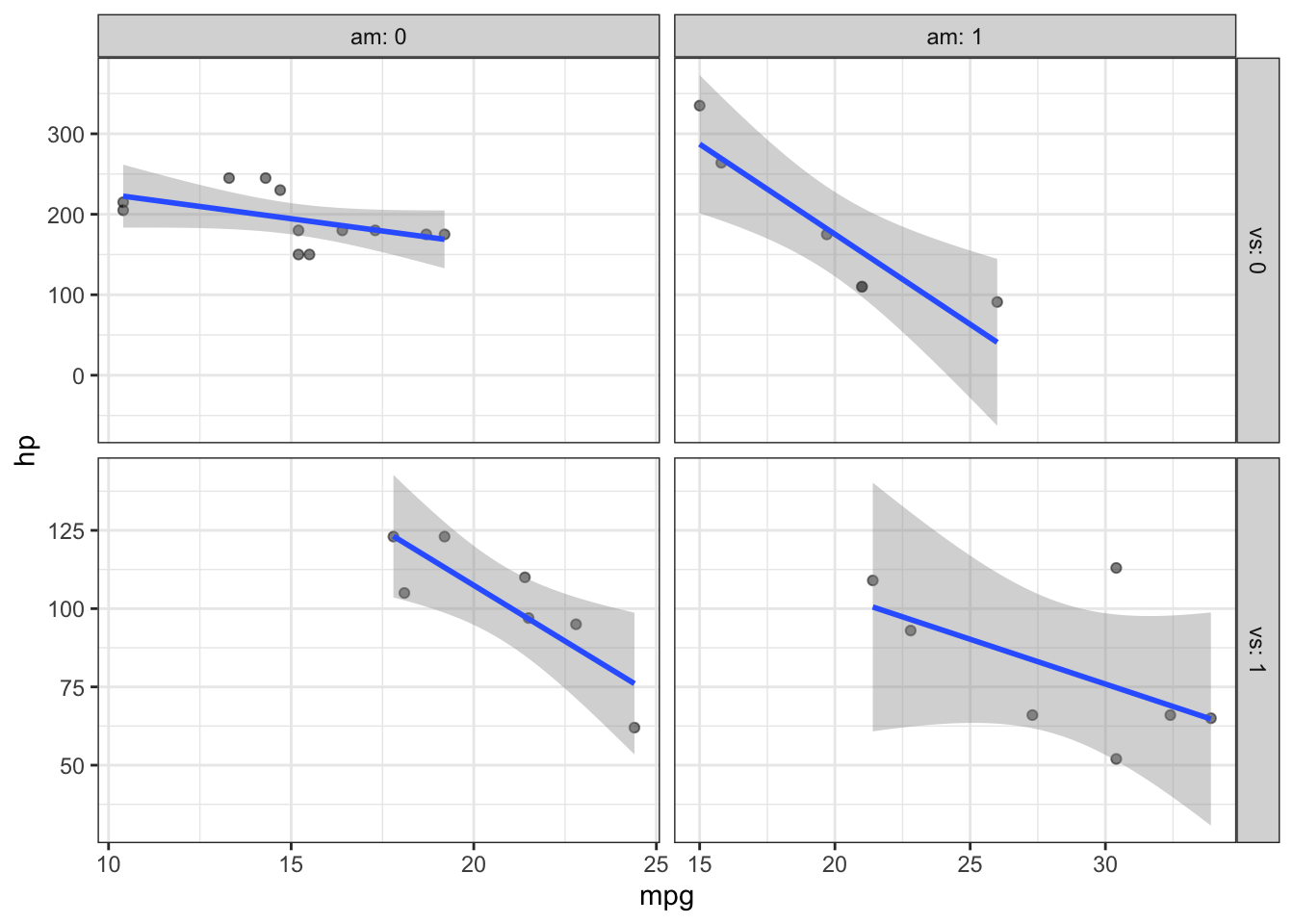
Here we are plotting the relationship between horsepower (hp) and miles per gallon (mpg) in a dataset of cars. I’ve used facet_grid() to further examine this relationship in the 2x2 factorial representation of “vs” and “am”:
vs  Engine (0 = V-shaped, 1 = straight)
am  Transmission (0 = automatic, 1 = manual)
However, from the default settings of facet_wrap() and facet_grid() we cannot easily discern this. This is where the labeller = ... argument comes in handy. Let’s set facet_grid(..., labeller = label_both):
p +facet_grid(vs~am, scales ="free", labeller = label_both)
Now we can clearly see that the transmission information (am) is represented by the columns while the engine information (vs) is present on the rows.
This small setting in ggplot2’s facet_*() functions can make all the difference when quickly plotting data, especially when using facet_grid() where the values of each factor are not clearly discernable.
A quick note about data viz
In these examples, I used the scales = "free" and scales = "free_x" arguments inside my facet_*() functions. This allows the axes to vary, which may distort the relationships when comparing across the facets. I did this mainly for illustrative purposes and would not necessarily recommend when interpreting real data. Exercise caution when freeing your scales!
Summary
When plotting faceted data using ggplot2, use labeller = label_both to increase readability of your facets, especially when the factors are not clearly labeled. Thanks ChatGPT for the tip!